Warwick’s new branding set for summer launch marking final months of the ‘W’ logo
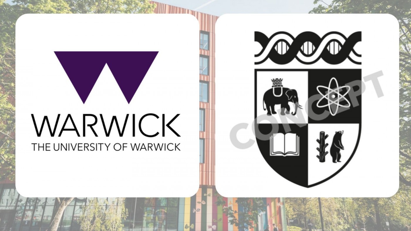
Warwick’s infamous ‘W’ logo is soon to be consigned to history after the University announced that the new ‘Modernised Crest’ branding is set for a summer launch.
The ongoing Brand Evolution Project will come to a close in the coming months, with a recent update from the University confirming that key resources are being “finalised” and “designed to ensure clarity and consistency in how the future identity is used”.
A brand portal and book to “ensure clarity and consistency in how the future identity is used” is currently being developed by staff to coincide with the brand update in the summer.
The project, which aims to “reflect Warwick Values, our purpose, and Warwick’s global ambitions for 2030 and beyond”, surveyed over 7,500 internal and external audiences, including current and prospective students, staff, and alumni.
The ‘Modernised Crest’ concept was chosen ahead of two other designs – all of which included the ‘unshackled bear’, adapted from the current ceremonial crest.
The final concept though – the soon-to-be ubiquitous ‘Modernised Crest’ – was overwhelming the most popular with the public
The first concept saw the bear standing alone sans staff, next to text reading ‘University of Warwick’, while the second incorporated the staff and ‘unshackled bear’ within an oval alongside the University motto ‘Mets agitat molem’ (‘mind moves matter’).
The final concept though – the soon-to-be ubiquitous ‘Modernised Crest’ – was overwhelming the most popular with the public. 85% of external audiences said it “conveyed ideas of the University, both past and present”, while 61% of internal audiences preferred it to the other designs.
One survey respondent said: “It’s a simple yet effective way to convey that we are always looking to move forward or ‘beyond,’ while still respecting the historical knowledge that has brought us to where we are today.”
The design retains the ceremonial crest’s principles – DNA strand, elephant, bear, and atom symbol – but replaces one of the two atoms for a book, as well as ‘unshackling’ the bear, and turning both animals to face the other way.
The redesign also uses a black, white and lilac colour scheme, as opposed to the current red, black, blue, yellow, and white.
Speaking to The Boar in December, a University spokesperson said: “The Brand Evolution Project isn’t just about a new look – it’s about creating a clear, cohesive story that resonates with our community and the wider world, that will support our student recruitment and build awareness of our brand across the globe.”
The University also plan to introduce a new ‘brand support service’ which will provide staff and students with “an additional channel” to discuss the branding
While just 160 students were consulted in the University’s controversial rebrand in 2015, the upcoming rebrand has seen input from over 10,000 students.
The design process for the current ‘W’ logo cost the University £80,000. It is unreported how much the current rebrand has cost thus far.
In addition to the rebrand, the University also plan to introduce a new “brand support service” which will provide staff and students with “an additional channel” to discuss the branding, including for “any specific brand needs, [to] get expert advice, and [to] ensure consistency in how [the] brand is used.”

Comments