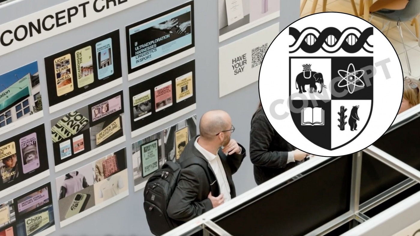
‘Modernised crest’ concept to be taken forward after University Brand Evolution survey
A modernisation of the University’s crest could replace Warwick’s iconic ‘W’ logo, after receiving widespread support in a public consultation into the University’s brand identity.
The ‘Modernised Crest’ concept came out on top in the University’s Brand Evolution survey, with 61% of internal audiences preferring it to other proposed concepts, which included an ‘unshackled bear’ surrounded by the University’s motto.
The new crest logo – which sees the bear unshackled from its ragged staff and one of the two atoms replaced by a book – will now be taken forward for further development, taking on board the feedback received.
The brand identity and positioning are set to be finalised by the University early next year, with the new concept set to replace the current logo if the project successfully moves forward.
The University launched their Brand Evolution Project in October, aiming to create a new identity which better reflects the University’s “values, purpose, and hopes for the future”.
The new brand identity will be “more than our logo”, according to the University, with a greater focus instead on Warwick’s ‘story’ and ‘reputation’. A new ‘positioning statement’ will also be adopted as part of the identity, setting out the University’s future ambitions.
Only 38% of [The Boar’s] readers said that they loved the proposed logo when asked on social media, with 62% preferring the current ‘W’ logo
3,500 people shared their feedback on the University’s proposals in the initial stages of the project, with over 7,500 people also responding to an online survey which gathered opinions on the proposed new identities.
As well as receiving positive internal feedback, 85% of external audiences said that the ‘Modernised Crest’ concept appealed to them and conveyed ideas of the University, both past and present.
Readers of The Boar do not seem as convinced by the ‘Modernised Crest’, though. Only 38% of readers said that they loved the proposed logo when asked on social media, with 62% preferring the current ‘W’ logo.
A respondent to the University’s consultation shared different feelings, however, praising the new design. They said: “I do like how the design evokes the essence of an old university crest without being a direct replica. It’s a simple yet effective way to convey that we are always looking to move forward or ‘beyond’ while still respecting the historical knowledge that has brought us to where we are today.”
Other proposed concepts, all of which incorporated the ‘unshackled bear’ idea, were not as keenly welcomed by audiences.
The least preferred concept, which sees the bear standing alone beside the University’s name, was described as “very random” by one survey respondent, while another added that it could represent “a zoo, wildlife park, or clothing brand”, rather than the University.
[The Brand Evolution Project is] about creating a clear, cohesive story that resonates with our community and the wider world, that will support our student recruitment and build awareness of our brand across the globe
University of Warwick spokesperson
Speaking to The Boar about the rebrand project, a spokesperson for the University said: “The University of Warwick has been working to evolve our brand to better reflect who we are today and our global ambitions for 2030 and beyond.”
They added: “The Brand Evolution Project isn’t just about a new look – it’s about creating a clear, cohesive story that resonates with our community and the wider world, that will support our student recruitment and build awareness of our brand across the globe.”
It is not the first time in recent years that Warwick has sought to redesign its identity. Back in 2015, the current two-triangle logo was adopted by the University – though the design was met with many raised eyebrows when it was unveiled, as students mocked the ‘aubergine’ design as looking “like a child has designed it”.
A petition was launched to try and halt the rebrand, gathering over 4,900 signatures. However, the rebrand went ahead, and the logo – albeit with a minor ‘simplification’ in 2023 – has remained the same since.
Student voices have helped us to understand more about Warwick’s identity throughout the brand project so far […] We are thrilled with the level of student engagement that we have received within the project
University of Warwick spokesperson
This time, the University has aimed to listen to the student community more as part of the rebranding process, a move which has been celebrated by those behind the project.
The University spokesperson told The Boar: “Student voices have helped us to understand more about Warwick’s identity throughout the brand project so far. This feedback has directly influenced the concepts presented in the recent market testing phase. We are thrilled with the level of student engagement that we have received within the project.”
Final touches will now be added to the new brand identity, as the days of the ‘Warwick aubergine’ seem to be numbered. The University added: “We will be using feedback gathered to make sure that the final brand identity will be distinctive and authentic to Warwick. We will be sharing updates and progress of the project in early 2025.”

Comments