A new HG Wells £2 coin is full of errors
Being immortalised on a coin is an honour reserved for important and significant figures in our nation’s history, and it’s the turn of sci-fi author HG Wells. But, what should have been a celebration of the author and his life has been marked by the revelation that the coin gets a number of things about his work wrong. How should we honour authors on legal tender?
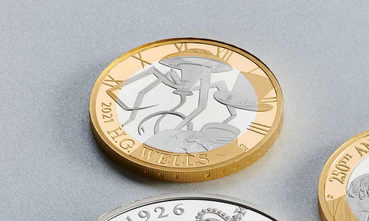
The £2 coin was intended to mark 75 years since Wells’ death, and it includes imagery inspired by The War of the Worlds and The Invisible Man. However, fans and scholars swiftly found a number of errors on the coin. The Martian tripod, a machine famous for its three-legged design, has four legs on the coin. Jack Griffin, the invisible man, has a top hat on the coin, but he arrives at Iping under a “wide-brimmed hat”. It also transpired that the quote chosen for the edge of the coin, “Good books are warehouses of ideas”, is an obscure Wells’ quote and uttered by a character who was expressing the opposite sentiment – that ideals should be hidden away in books.
There’s no mention of any literary experts on the [planning and design] panel
Adam Roberts, vice-president of the HG Wells Society, said: “It’s nice to see Wells memorialised, but it would have been nicer for them to get things right. A tripod with four legs is hard to comprehend (tri: the clue is in the name), and Wells’ (distinctly ungentlemanly) invisible man, Griffin, never wore a top hat… I’d say Wells would be annoyed by this carelessness: he took immense pains to get things right in his own work – inviting translators of his book to stay with him to help the process and minimise errors and so on.” This sentiment was shared by Stephen Baxter, vice-president of the Wells Society, who said that the author would have been “very flattered by the coin, but infuriated by that non-tripod”.
When the Royal Mint was asked about the issues on the coin, it said that the four-legged tripod was “an interpretation of the various machines in War of the Worlds, while the invisible man is “wearing a Victorian top hat to signify the era”. Designer Chris Costello said he was inspired by “vintage HG Wells book covers and movie posters”. The Royal Mint noted that all coins go through a planning and design selection process governed by a panel including experts in art, heraldry, typography, sculpture, history and numismatics (the study or collection of coins). There’s no mention of any literary experts on the panel.
I throw out these errors, but it should be stressed that, when these coins are done well, they’re wonderful celebrations of the lives of authors
This is not the first literary figure to be misquoted and misrepresented on money. In 2013, Ireland’s Central Bank misquoted James Joyce on a commemorative coin, writing the phrase “signatures of all things I am here to read” with an extra ‘that’. When the bank was confronted on the mistake, it claimed the coin was intended to be “an artistic representation of the author and text and not intended as a literal representation”. The same year, a new Jane Austen £10 note featured the quote “I declare after all there is no enjoyment like reading!”, which is spoken by a character with no interest in books whatsoever.
I throw out these errors, but it should be stressed that, when these coins are done well, they’re wonderful celebrations of the lives of authors. A series of Beatrix Potter coins placed the original illustrations of her most famous characters onto 50p pieces, and they were so popular, new coins have been issued every year since 2016. A Dickens £2 coin created the author’s famous profile from the titles of his works, while a Sir Arthur Conan Doyle 50p surrounded a profile of Sherlock Holmes with titles of his most famous cases. Last year, an Agatha Christie £2 was released, featuring a question mark puzzle piece among murder weapons.
At their best, coins like these celebrate the incredible contributions of great minds and people, distilling their stories into a recognisable or emblematic image. I think Wells is a significant figure who deserves the recognition, and I understand the motivation of the designers to paint in broad strokes, but the imagery of tripods and the invisible man is so well-known that it feels a little insulting to get it so wrong. Celebrating famous authors isn’t simply a matter of recognising their names – it also means you understand and accurately represent what makes their work so special in the first place.
Comments