Why you should never overlook design in politics: the Mamdani mayoral campaign
In a world of political jargon, convoluted messaging, and overstimulating content being hurled at you from every angle, Mamdani’s campaign cut clearly through the noise. But it wasn’t just through his slogans and beaming personality; a heavily overlooked but arguably crucial part of his campaign was its visual identity.
Now I’m not saying he was elected mayor because of a colour scheme, but in the same way you can immediately recognise the golden arches of McDonald’s or the iconic Nike tick, Mamdani’s campaign had a whole brand of its own, to the point that even if a poster or placard were illegible or in the distance you would still know what it was for. But why did Mamdani’s branding work so well and how did it bolster his campaign in a way that many modern politicians could take note from?
Mamdani’s entire persona is being the guy from your neighbourhood who understands your struggles and is going to be the one to actually combat them
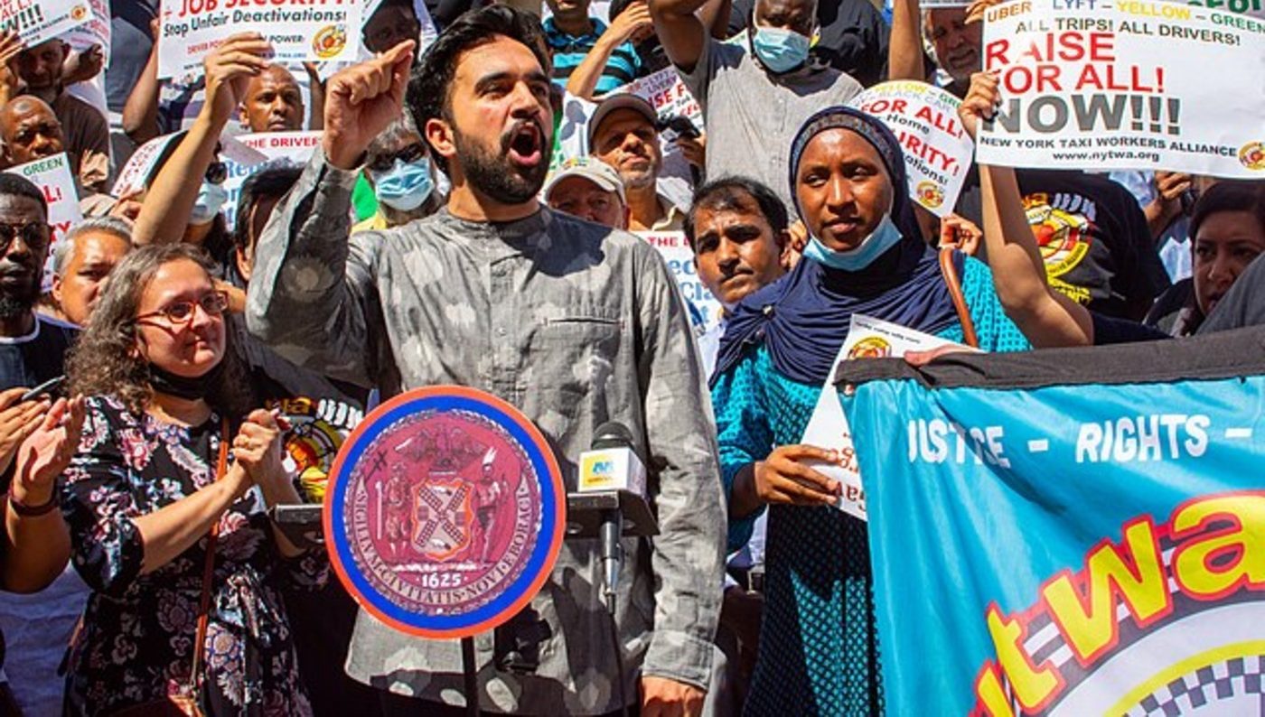
While it sounds obvious, what most modern politicians don’t actually consider is knowing their audience. Mamdani’s entire persona is being the guy from your neighbourhood who understands your struggles and is going to be the one to actually combat them. Directly from the logo, which resembled local grocery signs rather than party emblems, he threw political design conventions out of the window, showing he was new, different, and truly a New Yorker before even saying a word, which was a tenet of his campaign in face of the indicted Eric Adams and billionaire-backed Cuomo who hadn’t actually lived in New York for 35 years.
it evokes the “working-class fabric of the city” who not only keep it running but bring it alive with “cultural richness”, community and colour
Considering colour, the Mamdani campaign immediately stood out with its bold hues, use of both blue and red, and particularly its unique orange lettering, which was also a nod to his Indian heritage by invoking the flag’s colour and using old-Bollywood-esque fonts, particularly from the 1940 film Aurat which hangs on the mayor-elect’s apartment wall. In fear of sounding like an over-analytical English student, it’s not unfair to say this also communicated his bold stances and intent to make radical changes to the millions of New Yorkers walking past these posters every day. Aneesh Bhoopathy, the graphic designer behind these visuals, said the campaign’s primary colours also drew from those used by bodegas, yellow cabs, hot dog stands, and other small businesses to stand out in the hustle and bustle of the city, and even the vintage comic book look of the font served to evoke the retro hand-painted signs these vendors used. The entire visual system was developed by Forge Design, in collaboration with Tyler Evans who created the series of iconic posters we’ve come to love, alongside Rama Duwaji, a Syrian-American illustrator and Mamdani’s wife.
The design of Mamdani’s campaign truly breathes New York in every brushstroke. Not the side of New York overrun by billionaires and oligarchs, but it evokes the “working-class fabric of the city” who not only keep it running but bring it alive with “cultural richness”, community, and colour, as David Schwittek, a professor of digital media and graphic design at Lehman College, observed. It essentially epitomises authenticity, championing the everyday New Yorker living their everyday life, which is exactly what you want when you’re running on making that very life more vibrant and affordable.
By bringing back the very vibrancy of “happier political times” with the retro feel, Gavan Fitzsimons, a business professor at Duke University specialising in the impact of branding on voters and consumers, suggests this visual identity was able to call back to “an earlier time when politics was less divisive and the Democrats were perhaps more successful”. In our current era with the rapid rise of the right and the left only splintering further by the day, this could not have been more crucial for Mamdani to bring the electorate together.
The campaign design itself was cool enough that people were vying for campaign merch and came together in crowds to get it, which then rippled to form communities and build the campaign into the blazing success that it was
The simplicity and consistency across the campaign fostered community in and of itself, which, again, was a tenet of what Mamdani was running on: making New York a better place for his community of New Yorkers. With its distinctive but re-creatable style, local designers were easily able to jump on the Mamdani campaign train, creating their own animations, illustrations, and more that fit perfectly with the brand of bold colours and strong shapes. This community train went one step further, with door-knockers getting their own “Zetro cards” which, by filling them up with stamps each time they canvassed, earned them a limited-edition poster or t-shirt for a full card. The campaign design itself was cool enough that people were vying for campaign merch and came together in crowds to get it, which then rippled to form communities and build the campaign into the blazing success that it was.
As Mamdani himself highlighted in an interview with Gothamist, the campaign imagery was “an illustration, frankly, of the campaign at large”. Bold, authentic, diverse, and as New York as it could possibly get. With a portfolio of simple slogans, championing change, and underlining authenticity, the design of Mamdani’s campaign was able to represent this very simplicity, radicality, and authenticity through design alone. In such an overwhelming city, both physically and in its political climate, calling back to design basics was exactly the bold move Mamdani needed to soar straight to being mayor.
Comments