Comment Corner: The Warwick rebrand
As the 2024/2025 academic year came to an end, so too did the iconic ‘W’ brand of the University of Warwick. Replacing it is a brand-new image for the University, complete with a new crest, colour palette, and font. Needless to say, the changes have caused some controversy among the student body, with some in favour of progress and reinvention, while others resent what they see as needless change.
Four of The Boar’s writers have shared their views from all sides of the debate to reveal the student body’s opinion once and for all.
The redesign is the logo equivalent of trying to have your cake and eat it too
Did we need reminding that we’re Oxbridge rejects?
By Cianan Sheekey
When I saw Warwick’s new logo, the first thing that sprang to mind was how Oxbridge it was (as if I needed a reminder of the rejection that led me here). The odd iconography and serious tone in a modernised version of our classic badge suggest an attempt to maintain the modern element of the University’s branding, but also to project a logo as authoritative as one from an Oxford or Cambridge college.
Echoing those crests but retaining the theme of modernity, the redesign is the logo equivalent of trying to have your cake and eat it too. It feels off-kilter, mismatching the university it’s meant to represent. I liked how our previous logo separated us from those institutions. We don’t follow an esteemed academic lineage, or a “glossy city-university blueprint”, and our old logo, the imposing ‘W’, often coloured in purely purple (which seems accurate on a cultural level), emphasised that individuality.
The new University tagline also struck me as odd: “This is Beyond”. It’s typical meaningless marketing nonsense. We aren’t even ‘beyond’ Loughborough and Bath in the league tables.
I like the rebrand: I find it charming and academic
An old-school new beginning
By James Reglar
In my opinion, the Warwick rebrand is semi-goofy, almost cringe-worthy, and that is why it’s exactly the rebrand we need. A university brand image shouldn’t follow the same monosyllabic sleekness of large office brands, which is what the last brand gave us. A university isn’t a large sleek corporation trying to sell you something you don’t need. It’s a place people come to learn, grow, and experience new things. The image of university should be academic and slightly fusty.
The recent Warwick rebrand will, I’m sure, ruffle many feathers and cause many writers to furiously rage against it, using over-the-top, eloquent language for the sake of standing out. Similarly, there will be those hardline advocates for the new rebrand, claiming it’s the hit of desirability that Warwick needs. Even more frustratingly, there will be those who act and possibly write in an especially blasé fashion about the rebrand. Maybe they’re hoping to catch attention for being aloof and immune to the thinking of everyone else and focusing on ‘what’s really important’. If you can’t tell, I’ve written in all the ways above.
I like the rebrand: I find it charming and academic. I can see why people might not like it or have issues with it, but whether a good or bad one, it is at least a university brand, which the last one really wasn’t.
It comes across as the midlife crisis of an institution that has realised its monopoly on youth and modernity is fading
Is this really what our tuition goes towards?
By Jack Thompson
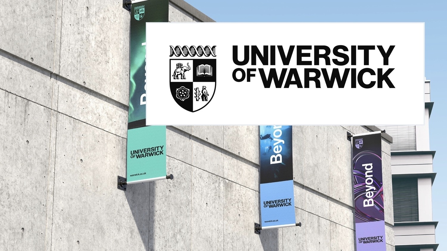
The new design of the Warwick logo, a crest featuring a bear, an elephant, a book, and an atom, emerged alongside the broader rebrand which introduced the ‘brand sign-off’: “This is Beyond.” The phrase, akin to those you’re likely to see on men’s garments from Bershka, claims to represent the University of Warwick’s reputation for ‘challenging conventions’.
The rebrand in its entirety has, however, rather successfully transformed the University of Warwick into looking like any other company. It comes across as the mid-life crisis of an institution that has realised its monopoly on youth and modernity is fading as it reaches its sweet sixtieth.
The only semblance of personality within the crest is found with the bear and the elephant, aligning with the animals found on Warwickshire’s and Coventry’s respective coats of arms to symbolise the University of Warwick’s connection with the local area.
The rebrand ultimately symbolises a waste of resources: the last rebrand to the infamous ‘W’ cost £80,000. An investment of £80,000 – which could have amounted to £280,000 if the similarly unnecessary introduction of The Forum, costing £199,726.80, was not pursued, could have produced tangible positive change in our local areas. That amount of money could vastly improve our systems of sustainability and contribute to a higher quality of life for both students and residents.
What exactly we are ‘beyond’ remains ambiguous
When you try your crest, but you don’t succeed
By William Moores
I’m slightly torn about the new Warwick rebrand. While I am broadly in favour of bayoneting Luddites, in the proverbial sense, and changing things up now and again, when it comes to this redesign, I have quite a few notes.
It’s important to remember that the purple ‘W’ had its flaws. For instance, what exactly it represented seemed to be generally unknowable. Additionally, its accompanying slogan, “Warwick, the University of Warwick” (as if we were some tuxedo-wearing, international super-spy) was incredibly farcical. However, it was uniquely Warwick and stood out in a crowd of stuffy university crests, reflecting our modern, untraditional approach.
This logo has now been traditionalised and modernised in what was presumably a significant moment for modern traditionalists worldwide. It sports a modernised crest and an even more comical tagline: ‘This is Beyond’. What exactly we are ‘beyond’ remains ambiguous. Moreover, what the rest of this, presumably cut-off, slogan is meant to say is also unknown, though many have floated, ‘This is beyond repair’ and, ‘This is beyond hope’ as potential candidates.
I fear that through this redesign, we will have lost something that made our university stand out
The presence of an elephant to represent Coventry, a city which most students spend the majority of their time disavowing, and a bear to symbolise Warwickshire, a county in which half of the campus happens to be situated, compound the feeling that we’re grasping at straws to signify a sense of history that simply does not exist.
While I like the new logo as a modernised crest and appreciate its overall design, I harbour deep-rooted resentment for the new ‘Warwick lilac’ and a personal editorial grudge at the absence of the ‘the’ before ‘University of Warwick’. Frankly, if they’re looking to cut letters, presumably to save on printer ink (desperate times and all), I would propose the University cut the words ‘This’, ‘is’, and ‘Beyond’ from the redesign as soon as possible. Additionally, I have immense problems with the self-evidently nonsensical equal weighting of STEM and Arts degrees within the crest, given their wildly different difficulty levels.
I fear that through this redesign, we will have lost something that made our university stand out. While I like the crest as a crest, I think having it as our primary logo will leave us lost in the crowd. Ultimately, by alluding to a fictitious sense of history and rejecting the modernity that makes us more unique, we not only present ourselves as something that we’re not but also limit our university in the process.
Comments (2)
I recall that the last rebrand was only c.2014/2016 when I was still in my UG. It was a massive failure in terms of student opinion. Lots of people felt it was a meaningless logo and a waste of money. Interesting to see it only survived a decade…
“A university isn’t a large sleek corporation trying to sell you something you don’t need.”
James, I hate to break it to you buddy…