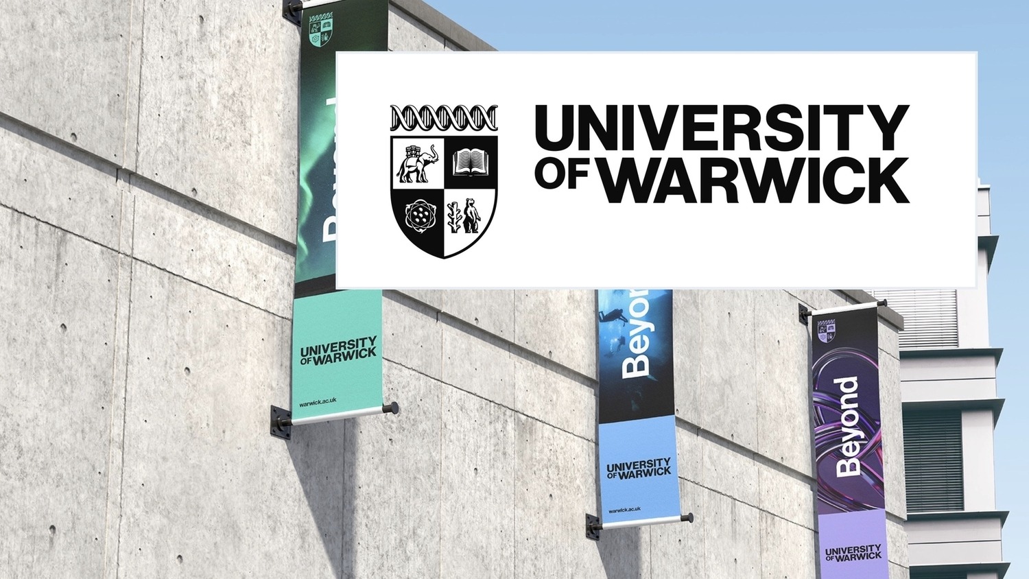
University of Warwick unveils new logo for sixtieth anniversary
A bear, an elephant, a book, and an atom: not the set-up to a bar joke, but features of a crest unveiled today as the University of Warwick’s new logo for its 60th anniversary.
The “evolved brand” was unveiled in an exhibition held in Warwick Arts Centre’s Helen Martin Studio, where digital screens replayed eye-catching close-ups of the crest’s constituent parts.
An exhibition board hailed the new “distinct brand position rooted in a culture of ‘unconventionalism’” that has been the outcome of a prolonged consulting process first begun in October.
Over 10,000 people were surveyed to inform creating the brand, ranging from staff and students, to alumni and prospective students in Europe, Asia, and North America.
Three initial brand concepts were whittled down to a ‘Modernised Crest’ emblem in December, alongside the positioning statement ‘Beyond’ as a guideline for Warwick’s international image.
To be part of [a redesign] with such a prestigious University has been really rewarding and I’m super pleased with how it turned out
Tobias Hall, Illustrator
Illustrator Tobias Hall, whose previous projects include anniversary artwork for Cadbury and a logo redesign for Norwich City FC in 2022, was commissioned to design the University’s new crest.
Hall enthused: “Elevating and modernising existing identities while retaining their heritage is always a really fun undertaking. To be part of that process with such a prestigious University has been really rewarding and I’m super pleased with how it turned out.”
The new logo has now been revealed to the world, with a rollout beginning immediately and being phased over the next three years. The rebrand has already changed the face of the University’s online presence, with both its X and Instagram profiles updated.
The University website has undergone a wholesale redesign. Pastel colour schemes and a new font – Neue Haas Grotesk – form the basis of the new page.
This is University of Warwick. This is Beyond
University website
The University website now features the words ‘This is University of Warwick. This is Beyond.’ in the incoming bold typeface.
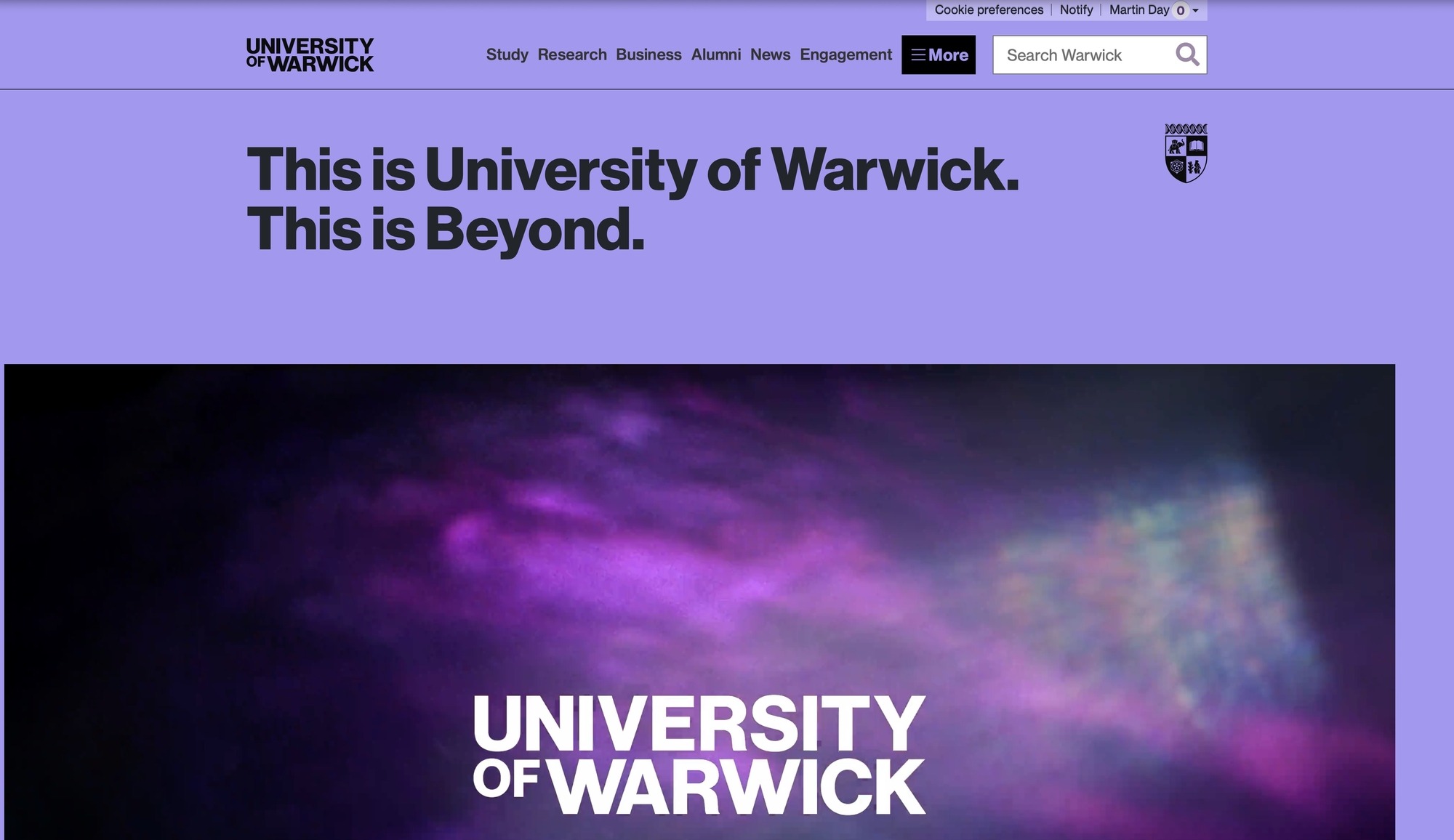
The new University website. | Image: University of Warwick
Stuart Croft, Vice Chancellor of the University, said: “In 60 years Warwick has achieved so much, but our focus is the future, how we can continue to deliver world-leading education, research and innovation.
“Our brand is critical to that success and I’m delighted with this new energised evolution, which so many staff, students and alumni consulted on.”
What are your thoughts on the new logo? Let us know on Instagram @theboarnews, or drop us an email at news@theboar.org!
Comments