Revisiting ‘Cheesy’ on PS1
In the mid-90s, home gaming was turning 3D for the first time, especially as the releases of the Nintendo 64 and the PlayStation 1 forced developers to think about that extra dimension. Companies like Nintendo ran with it, and made Super Mario 64 – new faces like Naughty Dog produced the Crash trilogy and a new gaming hero for the ages. Of course, not every attempt to translate a familiar character from 2D to 3D worked – the infamous Bubsy 3D is the perfect example. And new characters didn’t always work either, and nowhere is this clearer than in CTA’s Cheesy.
The information provided by both the box and the opening cutscene is the best part of useless, but the general thrust of Cheesy is this – you play as the eponymous mouse, who has been captured by a mad scientist for use in his genetic experiments. He works in a castle, which is then attacked by aliens with mohawks (of course), giving Cheesy a chance to escape his prison. The main objective of the game, then, is to escape the castle and collect a lot of cheese along the way.
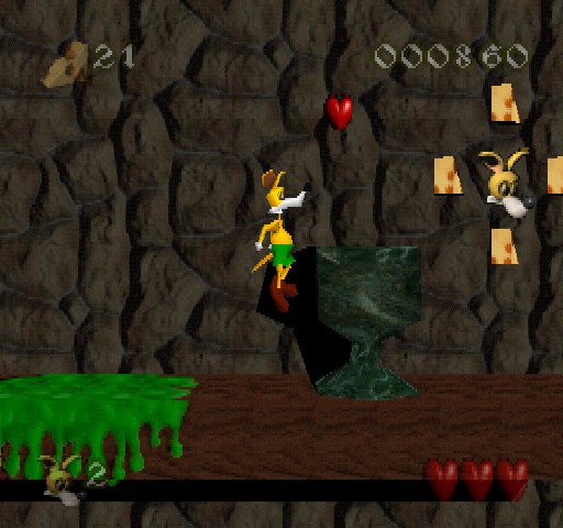
What this translates to is, at least initially, your classic PS1 platformer. And this is definitely an example from the early days, as developers were fully starting to get to grips with the rules of the genre. Some teething issues are understandable and, to an extent, forgivable, but I don’t think that’s the case when revisiting Cheesy. One of the reasons that people still play Mario 64 is that he controls like a dream – Mario is responsive and his movements are fluid. This is – to be charitable – not true of Cheesy, who is both sluggish and over-responsive in equal measure. Trying to send the mouse through the levels is a battle, even before you deal with any of the platforming.
Presumably the developers weren’t aiming for such a bleak atmosphere
I mention platforming, but there’s a lot more to the game than that, and that is one of Cheesy’s biggest faults. It barely manages to produce a competent platform adventure (in either 3D or 2D), then suddenly the game mode shifts – it becomes a shooter in the style of the early GTA games, and an on-rails shooter in the sewers. It continues to bounce between the different styles, but none of them feel that fun to play, and it’s just a case of replacing one type of depressing experience with another. The shifts scream ambition, but it’s ambition that Cheesy simply cannot realise.
To top it all off, Cheesy is a depressing game because it’s ugly and it has a matching soundtrack to boot. The castle environments lend themselves well to a claustrophobic level design, but it continues throughout the entire game – it’s dark, grey and not a single area stands out. There’s a depressing flatness to all of the levels that makes exploring them a very unappealing prospect. Coupled with a miserable score, and the experience of playing through Cheesy just drains the life out of you. In all fairness, it’s a good fit for the castle, but presumably the developers weren’t aiming for such a bleak atmosphere.
It took developers time to figure out 3D, and there would always have been stumbles along the way. It wasn’t one of the more high-profile examples, but Cheesy is one such case. We never saw the mouse again and, on the evidence of this game, it’s hard to see that as a bad thing. But, given CTA’s clear ambition, it would certainly have been interesting to see a Cheesy once the blueprints had been a little more established.

Comments