Forget judging a book by its cover: can we judge a book by its colour?
We’ve all been there: wandering through Waterstones, just browsing, and a book catches your eye. Without knowing what it’s about, it can only be the cover that draws you towards it. Particularly, it might be the colours of the cover that grab your attention, provoke a last-minute decision, and prevent you leaving the shop empty-handed. So, why are the colours of book covers so important in presenting that book to you, and can we really judge a book by its colour?
The design of book covers and their use of colour is a science. Although readers may only be faintly aware of this, as it’s something we don’t consciously notice, the colours of a book cover have been carefully selected to pitch the book to the reader. This is based on “colour psychology”; emotions are generated by certain colours and there are many detailed guides for authors and designers. Colours are used to market to a specific audience by hinting at the book’s themes.
Blue is a common choice for book covers because it’s calming, while also enticing and thoughtful, with a sense of depth
This is perhaps most obvious regarding the romance genre, with covers having clichéd red or pink accents to represent love, but it’s also done more subtly with other colours. Blue is a common choice for book covers because it’s calming, while also enticing and thoughtful, with a sense of depth (think water, sky). A classic example of this is the original Great Gatsby cover, where a dazzling yellow or red might sum up the roaring 20s, but a profound blue is a better match for the reflective story.
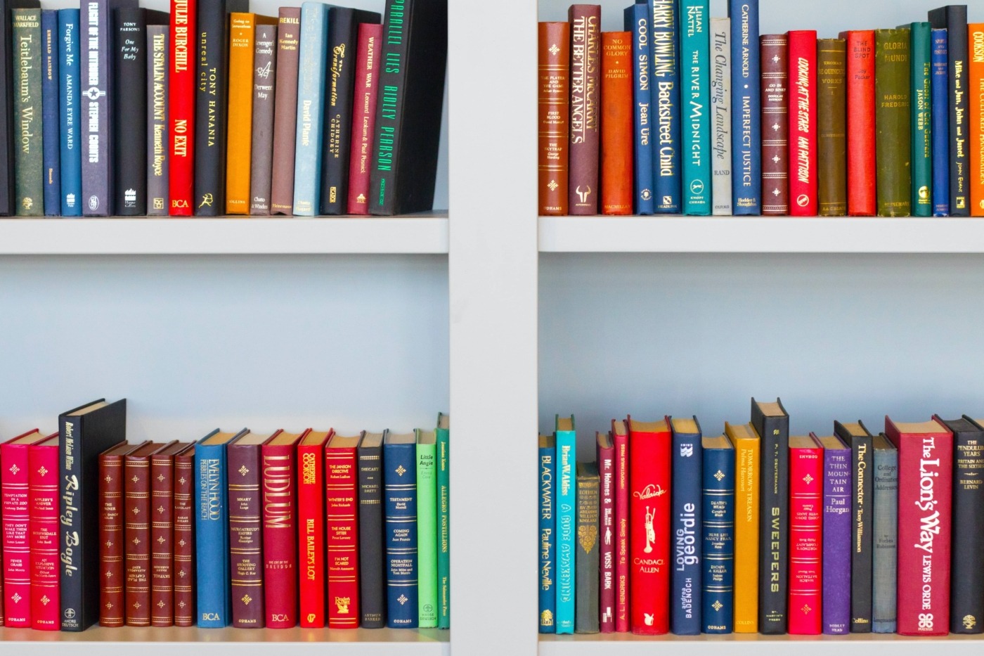
When I look at my own bookshelf, besides the many black-spined Penguin Classics for my English course, there are a lot of muted yellows and blues, while at the other end of the spectrum some bright red covers. Without voluntarily considering it before, the subdued colours of favourites like Mrs Dalloway and Never Let Me Go certainly capture the contemplative topics of the novels. By contrast the red covers, not romance novels here, are more political works, such as Christina Dalcher’s dystopian Vox, showing the versatility of colour in cover design.
Trends for 2021 suggest there’s a greater appeal for natural shades of green and brown on book covers, due to the sanctuary that nature has provided for many of us during lockdown
There is a careful consideration that has to be made, as Kelly Lawler, Creative Director for Adult and YA imprints at Sourcebooks explains: “if that feeling doesn’t match with the content of the book, you’re essentially causing confusion for a consumer before they’ve even picked it up.” The slightly wrong shade of red could for a second confuse a light-hearted romance with a collection of Communist short stories.
During the Covid-19 pandemic, we’re no longer being enticed by book covers in the flesh, as bookshops are closed. There’s fewer spontaneous purchases, as online we’re likely to be influenced by ratings and reviews that pop up alongside the cover. The actual colours we are attracted to might also change. Trends for 2021 suggest there’s a greater appeal for natural shades of green and brown on book covers, due to the sanctuary that nature has provided for many of us during lockdown. Equally, dramatic reds and blacks might lure us in, with the book’s promise of adventure, a desired contrast to the lack of action in our own lives.
While we’re told not to judge a book by its cover, it’s something we can’t really avoid, as we’re drawn to certain colours. Besides, if this speeds up the process of trawling through the millions of books available to us, it can only be useful. As the colours have been carefully chosen to match the book’s content, it’s likely the book will meet our expectations. So perhaps we’re not being so reckless if we do this over reading the blurb.
Comments