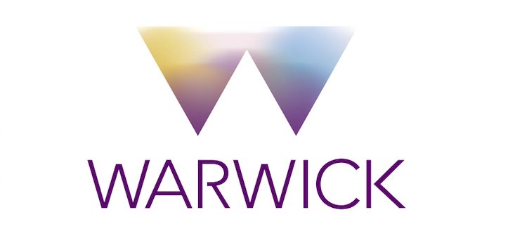
Warwick student uproar over new logo
Warwick students have taken to Facebook to voice concerns over the University’s new branding which was unveiled in a meeting earlier today.
The new Warwick brand image, alongside a new logo, was revealed today at the Students’ Union’s Societies Convention by the University’s head of marketing. The logo was supposedly designed as a “bold approach to its communications”.
The University’s marketing representative cited that similar logos at the universities of York and Exeter were part of the reason that Warwick decided to rebrand.
It was also revealed by the representative that the University had spent £80,000 on developing the new brand.
“Warwick aubergine”
A document which has been released by the University, states: “The new brand tone of voice introduces the language of possibility into our written communication.”
The document also states that the main colour in the logo is “Warwick aubergine”.
The new logo has been met with concerns from the student community. Many have taken to the ‘Overheard at Warwick’ Facebook group to voice concerns that the new logo does not match the reputation of the University.
The old logo was always a boring affectation of history from a new-build 60’s university. The new logo is crisp and modern and will look incredibly good on the stationery. I’m pre-ordering a mug.
Josh McNamee, PhD Engineering Student
Alex Shaw, a second-year Economics and Politics student, commented: “I hate it.”
He added: “It looks like a child has designed it. I fail to see how this represents Warwick at all. How is this an improvement on the last logo? How? It doesn’t even say university… it looks like it could be a logo for some mountaineering warehouse.”
Giles Hutchings, a second-year Maths student, stated: “I think it’s a waste of time and money. Students obviously don’t like it – the 300 or so at the convention moaned in dismay, and it turns us into this brand of a big W or an offshoot of the Weinstein Company (their logo is similar).
He added: “Which other universities have a big letter as their main image?”
Josh McNamee, a PhD Engineering student, commented: “The old logo was always a boring affectation of history from a new-build 60’s university. The new logo is crisp and modern and will look incredibly good on the stationery. I’m pre-ordering a mug.”
Student input
Concerns have also been raised that the University did not fully consult the student body.
The University’s report on the new branding states: “Especially our students have helped shape the new brand.”
However, the Boar has been told that the head of marketing had said that 160 students were consulted over the new brand image; this is less than one percent of the total student community.
Peter Dunn, director of Press and Policy at the University said: “Student input has in fact been extensive and has gone far beyond simply being presented with a new logo to comment on. Students were the very first people asked to take part in focus groups to help create the new branding and the number of students asked to help in that process and specifically consulted so far actually far outstrips the number of staff.”
He also added: “From the very beginning the SU President has been invited to all the meetings held to develop the Brands and of course also saw the presentation given to University Council of which she is a member.”
The Boar has set up a petition, calling for the university to halt its current plans and to open a student wide consultation. Sign the petition here.


Comments (15)
Seems to me like a lot of students are desperate to find something to do other than revise. The logo reflects a young modern institution, not one heaped in tradition and history. And that is exactly what Warwick is.
People need to bare in mind that our past logo wasn’t the crest, but the naff flicky R logo. Which definitely looks rubbish on a mug.
£80,000 so far before a single new logo applied, then consider how much it will cost to change everything connected to the University that has the current logo or the University crest on it – at a guess it will run into hundreds of thousands – money that could and should be spent on education! Changing sports strips only the tip of a very large iceberg…..
Leaked planning document http://i.imgur.com/odFzpjm.jpg
Say ‘Sup’ to DJ Warwick and his new pairs of sunglasses
https://www.youtube.com/watch?v=r97Nv8N7-mI
How well is that logo going to survive being badly photocopied in B/W? Poorly, I’d say.
Not impressed at all. 80k and not even that original – http://www.mscottvisual.com/wtvi/
New branding is cutting edge!! Bravo!
I’m honestly embarrassed to say I go to a university which claims to be world leading but has a logo as ametrur as that.
The brand guidelines require avoiding the use of ‘tentative language’: so why is the new university advertising campaign using the hashtag #definitelypossible?
It literally does not matter? At all? And it’s great that the Boar decided that 150 students weren’t representative, but that 300 and some Facebook comments is. Literally who gives a shit.
Similar moans were made at the sport meeting last term, already there are more people that dislike the new logo over the 160 surveyed.
Ignoring the controversy surrounding the cost, the new logo and brand is simply appalling and not fit for purpose. The current branding is simple, elegant and gives the impression of quality and sophistication. This is especially important when, for example, marketing the university to a large international population. The new logo does not look like the logo for an internationally renowned university and more like one for an internet startup or new media agency.
That. Is. Appalling.
£80,000? I would have done this on mspaint for less than a fiver