The Brilliance of Barocci
Brian Sewell headlined his review of ‘Barocci: Brilliance and Grace’ at the National Gallery “the greatest artist you’ve never heard of”, and this is the exact sentiment of my recommendation today. I had actually heard of him, so I could be sure that his work is both bathed in brilliance and gilded in grace. However it is fair to say most Brits, unless particularly well-travelled, or possessing an atypically invested interest in Italian Baroque artworks won’t have, because the sixteenth-century Italian painter is housed little in our collections and rarely the subject of one-man shows. There has been a gap in the Brits’ awareness and understanding of Baroque art for some time, and it’s about time that the missing piece is laid. That piece is Federico Barocci.
Perhaps, because we have too little an understanding of Baroque art, Barocci isn’t everything we’d expect (and I despise) of the period: melodramatic figures that despair, faint or gasp at the most subtle sign of disaster, crowded scenes where an over-eager artist has caged in the main characters with incidental clutter, and furiously (borderline carelessly) thick layering of paint which appears to whip its victims into a whirlwind. Essentially, I think of overlaboured panting, but Barocci’s is not.
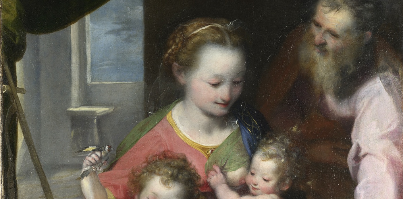
The Madonna del Gatto for example is a cosy scene of the Virgin Mary as a multi-tasking Mother. On one knee, and to one breast she holds the infant Christ, securely and serenely. To the other she presses the wriggling St John the Baptist, who – just a toddler – squeezes a swallow in his hand in a game to tempt the cat (gatto) into jumping up. It’s not a grandiose or particularly complex scene; visually rooted in the triangle formed by the mother and children. (A composition, which I must admit makes Joseph appear practically redundant, as, outside of the golden triangle he assists little, except offering an affirming glance.) In attitude it is light-hearted – a scherzo – that is, a playful scene; and has none of the Baroquely-attitude of an artist who takes himself too seriously. As such the viewer begins to get a vision of an artist who with wide eyes looks inquisitively and sympathetically on the world – a picture we have confirmed in the artist’s self-portrait in the final room.
Against all assumptions, Barocci’s paintings could be characterised as possessing a visual ease, a sense he creates most charmingly through his painterly touch. His light to the touch painting technique is emblematic of two sides of a paradigm. The things he paints are present, but they are also untouchable. His hand is so gentle on the canvas; that in wishing to reach out and touch the painting’s components, you get the sense that its contents would dissolve in your hands. This pairing is extremely satisfying to look at and strikingly appropriate for these heavenly figures. In doing so, Barocci imbues his spiritual subjects with the virtue of beauty and reveals the devotional eyes he looks through in order to paint them.
The impact of the diffused brushwork is sometimes delayed. While his colouring is alluring and immediate, his light touch has – at times – the danger of making those to which it has been most applied, appear indispensible. The best example of this is in the Immaculate Conception of 1574-5, found alongside the Madonna del Gatto in the first room. I often find Immaculate Conception scenes a bit — woolly. After painting the Virgin floating on the clouds, surfing on a crescent moon, artists’ imaginations often seem to go a miss, and the rest of the composition is awkwardly, if at all, filled. The result: a frame of scumbled beige.
I did at first think this was the case with Barocci’s version, because the subtly of detail that surrounds the Virgin took some time to appear to me. Layer after layer of putti orbit around the Virgin. The inner layer so faint you can barely see them at first (obscured by the radiant light of the Queen of Heaven), and yet they are so well-formed that once they become apparent, they feel as real as the on-looking figures, which – in heightened chiaroscuro – frame the painting’s base.
I also often find Immaculate Conception scenes artificial, and in some ways (given the nature of the event these scenes tell), they are justified in being so. However through his touch, Barocci creates a vision, which is imaginable. (It is a challenge to paint a floating head and not make it look out of place, but I dare say, Barocci has managed it.) The snapshot of life – a veiled mother cradling her beloved daughter – in the right hand corner – is also perhaps my favourite section of painting in the show; exquisite in its conveyance of materials, and of character.
What remains the most distinctive, and influential aspect of Frederico Barocci’s painting is still his use of colour. His figures are flushed with a salmon pink that is dabbled onto their exposed features. His altarpieces bring together a rainbow’s breadth of coloured robes, that could very easily lead to a clash and would draw away from the sense of delicacy he so deliberately achieved in his brushwork, but curiously it does not. Somehow he dresses figures in that ever so difficult colour, yellow, as if it might actually suit them.
In the Nativity of 1597 and Aeneas Fleeing Troy of the year after, shades of yellow are put aside their most unwilling partner: baby pink. Yet the balance is maintained, through, the cooling power of a steely grey such as on the head of Saint Joseph (in the studies for the Visitation) and the sky blue trim that lines the edges of the Virgin’s face in the Madonna del Gatto. Using cangiante – the effect of shot fabrics such as satin – Barocci daringly places blue alongside amber in the Entombment, and the colours are then – dependently and independently – echoed across the canvas to make them appear at home. The most sensitive remodeling of this chromatic coupling is found in the face of St John the Baptist, where the coral at the peek of his cheeks enhances the blue beneath his blown-about mop.
Barocci is a worthy subject for a solo exhibition, and the National Gallery have proven this by staging his introduction to the British consciousness in a manner, which truly celebrates the artist’s breadth of talent as a craftsman. His preparatory drawings (which I could very easy go into great depth about) are revealing and not just wall-fillers, and the collection is a cohesive and complimentary whole. Leaving this exhibition, I still bullishly believe that Federico Barocci is the best artist you’ve never heard of, and it’s about time you don’t just hear, but see of him. Starting, with his endearing self-portrait.
Comments