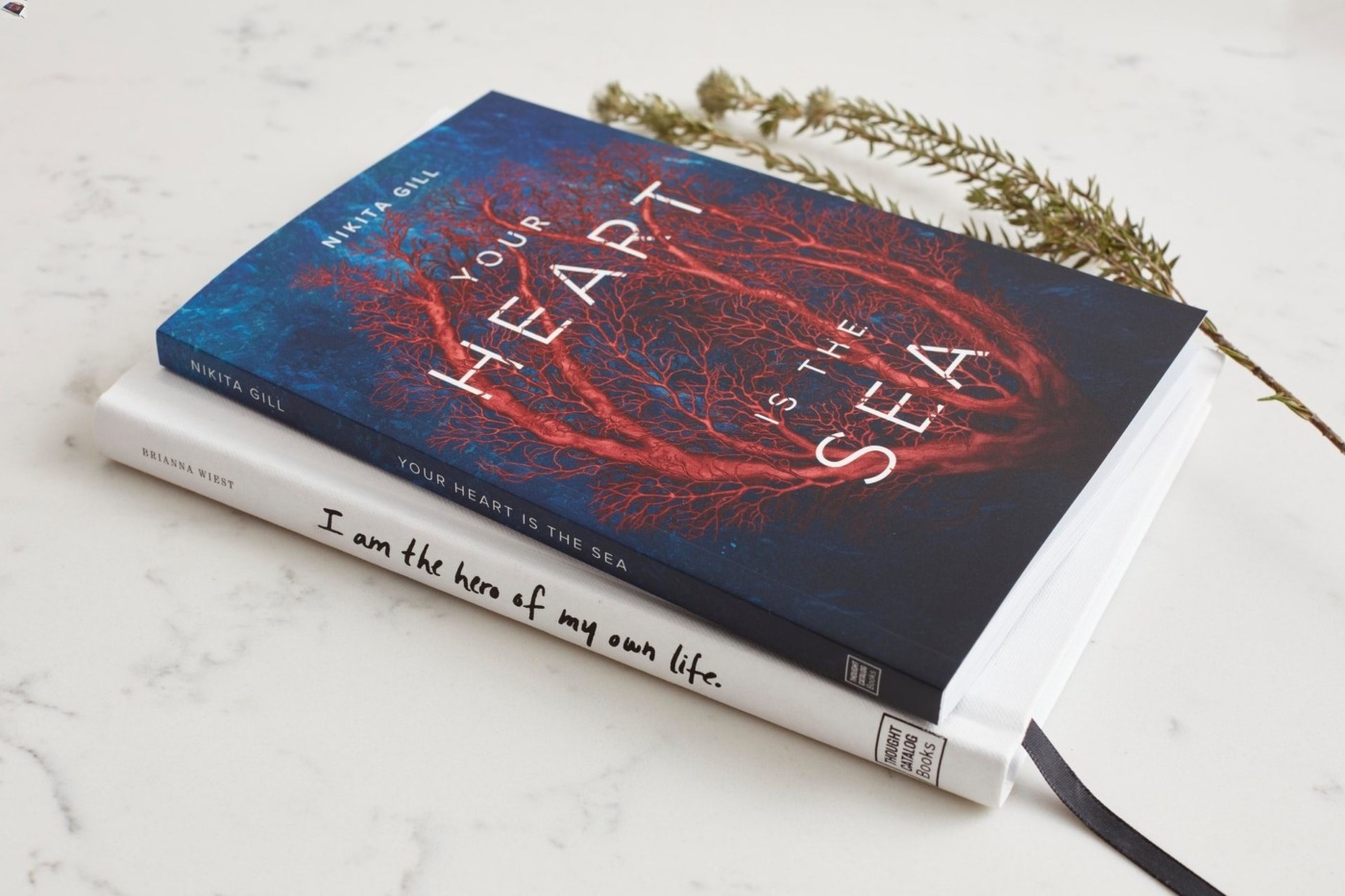
Can we judge a book by its cover?
Strictly speaking, books cannot really be written; only manuscripts can. After an author writes the manuscript, it is often the role of the publisher to make it available to the readers by giving it a form, be it digital or physical. That naturally means designing a cover.
It is almost ironic how crucial the design can be — after all, good literature symbolises the power of words. Yet, the effect of book covers on sales shows that an image might indeed be worth more than the 50,000 words found in a typical novel. First impressions matter, and the cover often determines which books are noticed in a large bookstore. Publishers know this, and bigger publishing companies pay their designers on average $1000-$2000 for a cover. It can be a lucrative business, but designing an effective book cover is by no means a straightforward task.
The most important aspect of designing a cover would be to capture the essence of the book, its spirit. Ideally, we should in fact be able to tell a lot about a book judging by its cover; though proverbially we are warned against this. Perhaps this is because the saying became popular before the craze for sophisticated marketing began?
The book… is a visual element that forms part of our surroundings, and it often looks just picture-perfect
All these beautiful book covers, creative and as diverse as the books they represent, make going to a bookstore an even more enthralling experience. One of my fondest memories from travelling alone is spending three hours roaming around a bookstore in Brussels, looking at the book covers with no intention of actually buying anything. It is an experience similar to that of visiting an art gallery. In some ways, this can be literally true — a soon to be released science-fiction series of Penguin Classics will feature line drawings from artists and designers including Picasso, Le Corbusier and Herbert Bayer on its book covers. This is a fascinating idea, and a fitting one for sure: after all, both artists and writers use creative ways to tell us something about the world.
For physical copies of books, a fitting design can truly improve the reading experience. As we read, the book is around us for days, lying on the bed, window still, dinner table, at last the bookshelf. It is a visual element that forms part of our surroundings, and it often looks just picture-perfect: find #bookstagram on Instagram to be convinced.
Yet, reading is more than just a visual or an intellectual experience — other senses are involved as well. I know I’m not alone when I say that I enjoy feeling the thinness of the paper as I flip the pages, and the physical effort entailed in holding them down so that they don’t cast a shadow. When opening a new book, I lean in to inhale the smell of fresh paper. Later I observe as the book wears out during reading; its spine wrinkling, the binding loosing up and the pages turning more easily.
A tactile book cover naturally adds delight to all this touching and feeling. One way in which a cover is made tactile is embossing, which creates relief on the paper. This technique is also used to write in the Braille alphabet, and I really love how subtle the effect is visually, in order to stimulate the other senses. An embossed pattern on a book cover is like an intrinsic detail, luxurious and yet modest. It makes the object seem more valuable.
What ultimately makes a cover good or bad is how well it captures the essence of the story inside
I think that The Great Ideas series, part of Penguin Classics, is an excellent example of how lovely embossed book covers can be. I enjoyed running my fingers over the cover of Meditations by Rene Descartes so much, it almost distracted me from the reading! Because of how simple embossing is technologically, it fits well with philosophy and other classic non-fiction.
While embossing can work wonders with a minimalist design, there is a variety of other techniques used to create a different end goal. Take covers for teenage fiction for example — they often benefit from bold fonts, bright colours, and the occasional glisten brought about by the use of foil. I remember loving this as a child; the way part of the cover would shine in sunlight, and the additional texture it provides.
What ultimately makes a cover good or bad is how well it captures the essence of the story inside. If all designers meet this goal, we would be able to judge a book by their covers and choose the perfect story after a quick glance around. Sadly, the world is not this perfect. For now, it might still be beneficial to read the backside description… having appreciated the design first.

Comments