The Boar’s best controllers
Controllers are essential to console gaming. They are the medium through which we interact with our characters and worlds. As many gamers will play for hours on end, gripped to their controllers as if it were an extension of their own bodies, it’s essential for a console to have good controller design. But how do you measure that? With the recent reveal of the PS5 controller, we now have both Microsoft and Sony’s answer to that question. Join me in examining how such designs have evolved over the years.
Sony and Microsoft’s focus when creating and updating new controllers is that of ergonomic sleekness. This is most visible in the designs of the Xbox 360 and Xbox One controllers, which retain the inherent bulk of the original Xbox design yet are shaped to fit the curvature of a player’s palms.
The Series X controller seeks to continue this tradition, with a design that is incredibly similar to that of the Xbox One controller. However, the addition of an updated D-Pad offers far easier diagonal movement and makes a standout change in the design.
Sony has also sought after a sleeker design through generations. Whilst there isn’t much change between the forms of the PS1, PS2 and PS3 versions, retaining the classic rigid demeanour, the PS4 controller marked a definite change in this attitude. The removal of the bumper buttons and joystick extensions allowed the new design to be significantly more streamlined, aiming to soften the harsh edges of the previous design.
This was also thought about in the PS5 design, with Sony extending the slight curvature across the sides, resulting in a fantastically slick new design. This is a philosophy also undertaken by the Google Stadia. Looking at the controller, it’s easy to see that the inspiration arrived from this generation’s controllers.
The Wii Remote was an innovative piece of technology, integrating motion technology in a way gaming had never seen before
In a sense, Nintendo acts as an outlier to this trend, namely with their increased focus on providing players with a range of options and their resolve to come up with innovative controller designs. The generations of Nintendo controllers stand out just as much from each other as they do to their rivals’ designs. Each is original and different from the next.
The SNES controller took the backbone of the NES and added new buttons to fit more comfortably in a player’s hand. The N64 forged its own path with the bizarre choice to add a third grip in the centre of the controller and to centre the joystick upon it, making it quite difficult to hold. With the GameCube, Nintendo once again changed the entire form of the controller, although it is probably the most traditional of their controllers, aside from some odd button shapes.
Then, we get to the Wii. The Wii Remote was an innovative piece of technology, integrating motion technology in a way gaming had never seen before, while pairing up with the Nunchuck gave the console some resemblance to the industry-standard of control schemes.
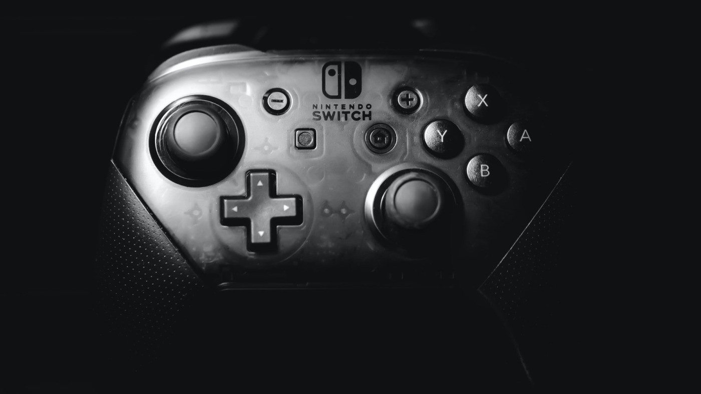
The Wii U then brought along the Wii U Gamepad – a huge controller, tablet-like controller that was ultimately under-utilised. The Nintendo Switch’s Joy-Cons took versatility to a whole new level, acting as a motion controller, an extension to the console, and as its own unique controller, although they have been plagued with drifting issues. Every generation of Nintendo controller brings innovation to the competition and leaves a memorable impact.
One of the biggest changes to controllers in recent years is the addition of dedicated share buttons. While the Xbox One controller lagged behind its current-gen rivals, the new Series X controller steps up its game with this addition. The share button acknowledges communities in gaming by allowing the player to easily engage with fellow players through recordings of their content. It also acts as a great medium for those who create montages and videos using gaming content, which can often be found across YouTube nowadays.
For the new PS5 controller, the most obvious change is the colour scheme. The biggest change between the PS1 and PS2 controller was the choice to move from a stark grey to black, which served for the following generations. Sony has now moved to a monochromatic scheme, exaggerating the glow of the power bar which lies in the centre of the controller. It certainly stands out against the stark black design of the PS4 and Series X controllers.
Personally, my favourite controller to use is the PS4. The PS4 controller retains elements of the Playstation’s iconic design while managing to feel significantly more comfortable. It’s not too bulky and fits in my hands perfectly. My least favourite to use is probably the N64 as, despite my respect for its originality, the joystick lying on the central grip means that I end up holding it in a position that becomes uncomfortable quickly.

Comments