In defence of Warwick’s re-branding
[dropcap]T[/dropcap]he overwhelming majority of Warwick’s student voice has been entirely against the Warwick rebranding. Hiran Adhia, editor-in-chief of The Boar started a petition to ‘halt’ the process. It now has well over 5,000 signatures. As is often the case when proposals for change are put forward, a lot of attention has been given to those on a crusade to resist the change. Instead, I’m giving a voice to the silent students at Warwick who haven’t signed the petition and who, by my calculations, are 18,000 strong.
The objection to a lack of consultation with the student body throughout the process is entirely justified. But halting the rebranding is not the answer to the systemic problem of Warwick’s bureaucracy.
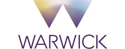
First of all, Warwick University has never before had a brand or a logo. The process we are witnessing is therefore not a rebranding but a branding.‘The University of Warwick’ is not a brand, and the words in capitals with the ‘flicky’ R is not a logo but merely a title. There is nothing unique or innovative in it, and it is anything but eye-catching.
Like it or not, we live in an increasingly commercial, consumer-driven society and in order to succeed, a business has to have an appealing brand image. And, like it or not (and I do not), the world of education is becoming increasingly commercialised, and as such, the businesses within education will have to move with the zeitgeist and have an appealing brand image that crucially needs a recognisable logo.
Adidas, Nike, Apple, Shell, Volkswagen, Facebook, Penguin, GlaxoSmithKlein, McDonald’s: every successful brand in the world has a unique and recognisable logo.
Criticisms such as “that’s just an apple, it doesn’t look like a respectable technological brand”, are now being replicated against the move away from the boring Times New Roman (with a twist) text which has been used to represent ‘the university’ up until now. The success of a new brand image cannot be measured in a rush, and certainly not before it has gone live.
It is regrettable that the world is an increasingly commercial one, but the reality is that to remain competitive, Warwick has to be innovative. If you don’t think the new brand looks like a university logo, then that’s because our views of what a university should be like are based on antiquated ideals borne out of ‘Oxbridge’. They can pull it off, they have the history and that is their brand image. But we -relatively speaking- don’t have any, so let us not compete with them on that.
However, an innovative Warwick brand can forge ahead and create worldwide appeal. Don’t be so resistant to change. We need something unique and innovative. If McDonald’s can be known by its golden arches, then why can’t Warwick be known by its multicoloured upside-down triangles?
Comments (8)
I would put this argument in a much simpler way. Warwick has always been a young and forward thinking uni. Just look at the new massive Big Data grant we got (and our ranking in the top young unis in the world)! Warwick is a vibrant uni with much to offer so I think a new logo is a great way to put Warwick on the map as just that during its anniversary. Why have a logo that is literally the same as every other uni in the Russell Group? Also, I don’t see the point, how will a re-branding affect students? I doubt someone will say: “Nah, I am not going to Warwick to study, their logo is way too purple”.
‘Warwick University has never before had a brand or a logo’ – seriously, did you not bother to do rudimentary fact checking? The old University Branding is as detailed and proscriptive as the new branding (in fact more so since the new brand incorporates colour flexibility). Furthermore the old logo is nowhere near Times New Roman, it’s a custom Serifed font, and the University official font is Fedra, or Arial in a pinch.
You can read all about it here, something you should have done before writing.
http://www2.warwick.ac.uk/services/communications/corporate/
I fully appreciate that you might like the font, and that a dissenting view to the campaign is valid and important, but can’t the Boar at least find someone who is willing to read up on the subject before belching out some drivel?
Fun fact: of the Forbes top 10 most valuable brands, 4 have a logo which is just the name of the company in a swish font: Microsoft, IBM, Coca Cola and Google. Five if you count Samsung, which is just the name on a blue oval.
5000 people disagree, 18000 therefore agree? No gun. Half the students I spoke to disagreed, just too lazy to sign a petition.
Nowhere is it claimed in this article that the remaining students at Warwick who have not signed the petition ‘agree’, merely that there are 18,000 students at the uni who haven’t signed the petition.
We’re a University, not a multi-national corporation (even if Warwick behaves that way at times.)
Look at other successful Universities: Oxford, Cambridge. You don’t see this crap going on there.
The fact that ‘this crap’ is not going on at Oxford and Cambridge is exactly what I object to (see final 2 paragraphs). We have gravitated towards a narrow model created by institutions defined by their history, like a 5 year old boy styling himself on his 85 year old Grandad. We’re a young university capable of setting new trends rather than adhering to the old model.
“If McDonald’s can be known by its golden arches, then why can’t Warwick be known by its multicoloured upside-down triangles?” This is the crux of the problem people have with “the world of education is becoming increasingly commercialised” — we don’t want our Uni degree to resemble mass-produced fast food. Do you really aspire to such a mindless career free from thought as one inspired by the McDonald’s corporation? Because, trolling aside, this message is subconsciously implicit in corporate re-branding efforts. Would you like fries with that?