Harry Potter: Adult Cover, Children’s Book?
During my younger and more vulnerable years, more specifically the Speaking and Listening section of my English Language GCSE, I had to write up a list of things I would put into Room 101 (you know, when it was still funny). I don’t really remember much of what I wrote or said, except that at the top of my list, above even ‘vegetables’ or ‘English Language GCSEs’, were the adult Harry Potter covers.
I have always found the idea of adult covers for Harry Potter arrogant. For a start, what is an ‘adult’ cover? Are they going to start stacking them at the top of the shelves at Waterstones? Beyond that, people were actually buying them and I couldn’t fathom why. Did the thirty-something year-olds on the bus really think that they were reading something different or more intellectual than me simply because there was a dark, brooding photograph of a locket on the cover as opposed to a cartoon? Don’t get me wrong, I have no problem with adults reading books originally written for children or young adults: indeed, these genres are where some of the most innovative and exciting literature is being written nowadays (not just Harry Potter but His Dark Materials, The Fault in our Stars, The Hunger Games, Miss Peregrine’s Home for Peculiar Children, to name but a few).
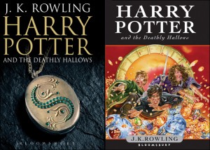
Harry Potter and the Deathly Hallows: ‘Adult’ and ‘Children’s’ book Covers
But I do dispute this attempt to create distance between the text, the larger phenomenon, and your reading experience. “Yes, I’m reading Harry Potter but not the same Harry Potter that people are queueing up for or screaming about.” Maybe I’m just defensive because I was screaming about it (and do, to this day, own four Harry Potter related t-shirts and sleep with a ‘Ravenclaw’ banner above my bed). Even so, there has always been an implicit judgement of my relationship with the books, as if it weren’t thoughtful or introspective, as if it were lesser than someone else’s.
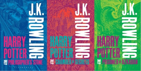
So these new designs did pique my interest or, maybe more accurately, my ire. I was glad to see they’d lost the faux-darkness, injected some fun, colour and some stylish (if a little boring) typography; but somehow they seem even more absurd now. Not only have the ‘children’s’ editions been redesigned absolutely beautifully with woodcuts by Clare Melinsky. Although the original covers feel like the ‘right’ ones, Melinsky’s designs bring a subtlety which I’ll admit was lacking in the first editions. However, now that everyone, adult or child, is coming to the books fresh again no cover need have any associations with the larger franchise. I can conceivably see that, when the books were clearly the most important publishing event of the 21st Century, adults wanted to read them but didn’t want to infantalise their taste (which is understandable if a little intellectually insecure). But now all the new covers are as separate from the movies and toys as they’re ever going to be; so why are we still drawing this ridiculous artificial line between adults and children?
[pullquote style=”right” quote=”dark”]Forget ‘don’t judge a book by its cover’, we’ve allowed the cover to tell half the story, to tell us how intellectual our reading habits are[/pullquote]
The deep, underlying problem is, clearly, the continual desire to re-frame Harry Potter as ‘more than children’s fiction’, as if children’s fiction is something lesser than adult fiction and therefore it’s success is inexplicable until qualified as such. In the real world, those distinctions don’t mean anything: for example, is Little Women a children’s book? I mean, I read it as a child. What about Alice in Wonderland or the real (and more gruesome) Grimm fairy tales? These are just a few books that we accept as belonging in both ends of the bookstore and with different cover, despite the text being the same. The difference is, of course, that there are many covers of these books, and therefore there is more variety than mere ‘adult’ and ‘child’. So it is in Harry Potter that we find this distinction at its most stark and unsettling: it’s ultimately a publisher’s fallacy. For example, the RRP for the children’s edition is £6.99 but is £8.99 for the adult cover – a redesign is yet another excuse to raise the price, if only temporarily. It also doubles their market: if it becomes shameful to read the children’s cover on the tube, then you won’t borrow a copy from a friend’s son but buy your own. The issue of covers may seem trivial but it cuts right to the heart of how publishing houses and marketing departments sell books to us, above and beyond the message of the story.
It also speaks to a greater problem: this is, like most things, not just the fault of ‘evil companies’ but also a fault in our own thinking. There is nothing wrong with publishing companies trying to make money: it is (unfortunately) a dying industry after all, and Harry Potter is as much Bloomsbury’s success story as J.K. Rowling’s. However, I would also argue that they are tapping into a larger, more worrying desire for us to continually canonise our literature, to separate what is mainstream from what is smart. Publishing companies have tapped into this in order to create ‘beach reads’, ‘guilty pleasures’ and ‘chick-lit’. These are artificial categories that literally mean nothing but make people feel like what they’re reading isn’t really reading because it isn’t Tolstoy or Proust. Book covers are a huge part of that marketing: someone in an office picks a pink cover and a girl with her head cut off and it becomes chick-lit, a black-and-white photo and it’s adult. Forget ‘don’t judge a book by its cover’, we’ve allowed the cover to tell half the story, to tell us how intellectual our reading habits are.
 Thankfully I think that these barriers are breaking down. Television is perhaps the best example (maybe because the idea of being snobby about television is a relatively new one): take Doctor Who or Game of Thrones. Sure, people still read Game of Thrones and say “It’s good… for fantasy” but they are reading it and the HBO show has been a tremendous mainstream success. This speaks to a hopeful future, where debates about what is ‘worthy’, ‘mainstream’ and ‘intellectual’ are replaced with old-fashioned subjective debate about what is good. I liked to think that Harry Potter was a step in that direction too, until this cover issue reared its ugly head again. Maybe the truth is that it never mattered to me what the covers looked like but what they represented for me when I was fifteen and now twenty-one. I just hope that the next time they re-design, it’s for a definitive edition: for, as Dumbledore taught us, “We are only as strong as we are united…”.
Comments (1)